












Insights / Footwear brand identity
Vegan footwear brand identity: how Mārche put its name in gold
A classic serif, a macron over the A, an R that takes a step, and a box that says thank you.

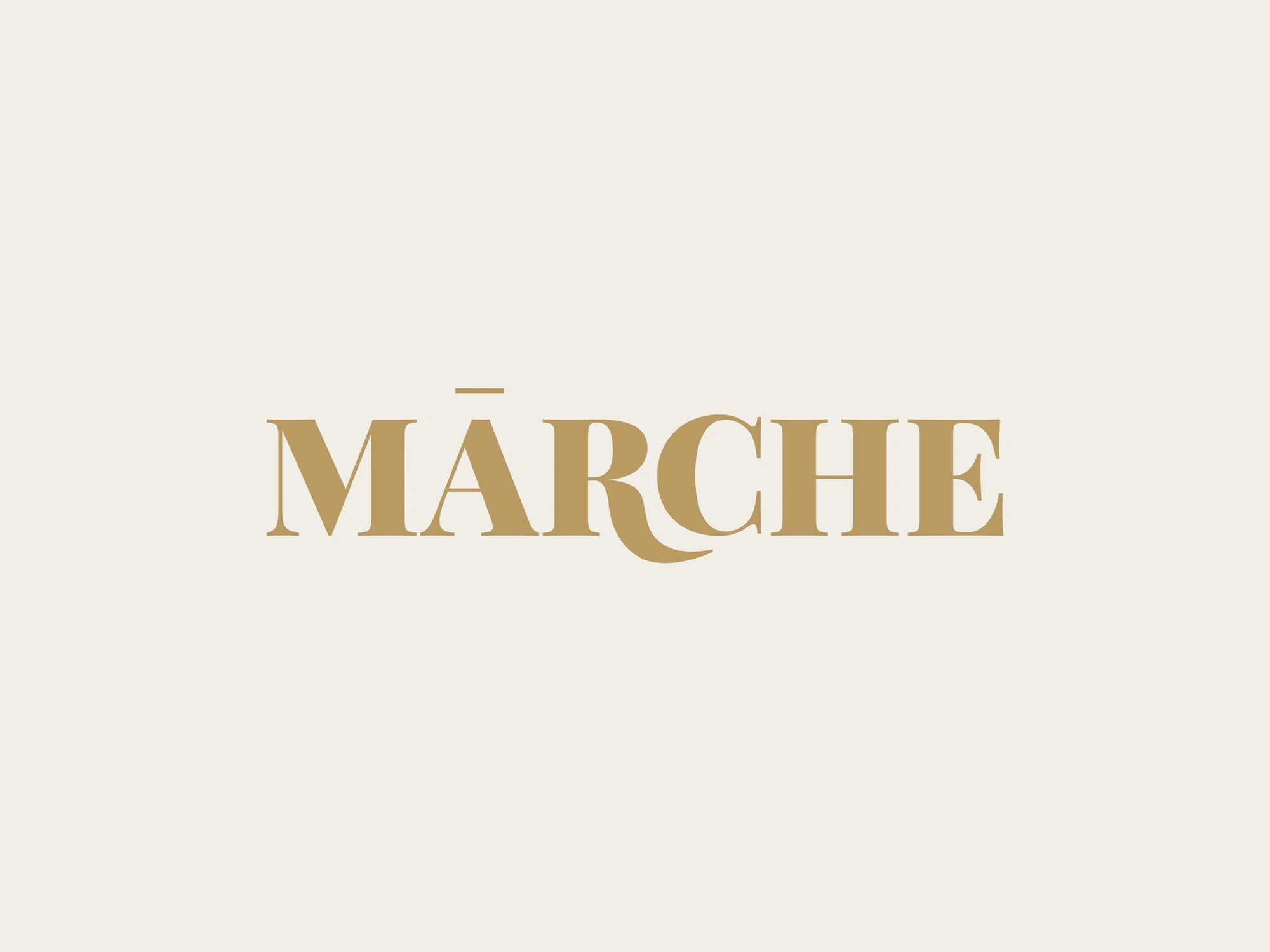
Footwear is a crowded shelf. Every brand promises comfort, every brand promises style, and most logos look like they were set in the same week. Mārche had something the others didn't: it is vegan and PETA-approved, a one-stop shop for every shoe need with nothing taken from an animal. The identity had to make that feel like a choice of taste, not a compromise.
A classic serif, with two details
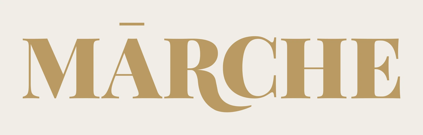
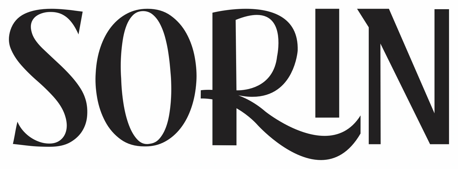
We started with a classic, high-contrast serif in capitals, the kind of letterform people already associate with fashion labels. Then we added two details, and only two.
The first is a macron over the A: a single bar that turns MARCHE into MĀRCHE. It slows the word down, gives it a long vowel and makes it look like a name rather than a word.
The second is the R. Its leg doesn't stop at the baseline; it steps out, curves down and sweeps under the C. A footwear wordmark with a letter that takes a step is a small joke that rewards a second look.
Two details are a signature. Ten details are decoration.
Gold, ink and white
The brand colour is a warm gold on cream. It reads as premium without the cold shine of foil, and it sits well beside natural materials, woven straps and nude tones. For everything else, the same wordmark works in ink on white and in white on ink, so it holds up on a receipt, a social post or a dark shop sign.
One wordmark, three grounds, no exceptions.
The box says thank you
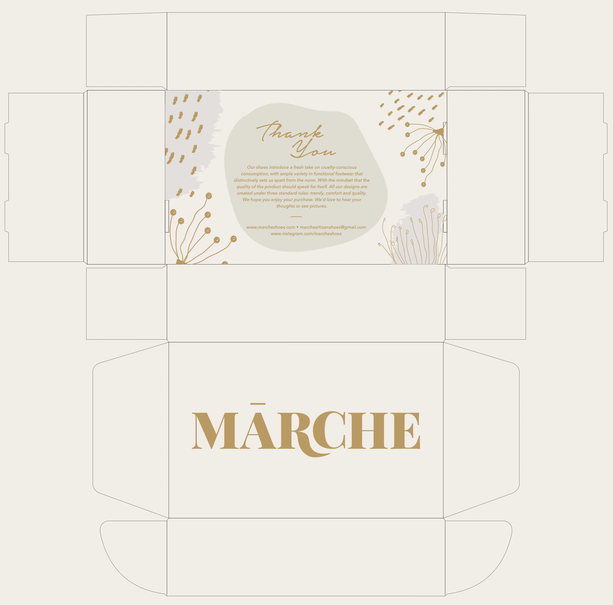
For a direct-to-customer shoe brand, the box is the shop. We designed the mailer: the name in gold across the lid, and inside, printed where the customer looks first, a thank-you note surrounded by hand-drawn botanicals.
The note says what the brand stands for in the brand's own words: a fresh take on cruelty-conscious consumption, and designs made under three rules: trendy, comfort and quality. It ends with an invitation to share thoughts and pictures, which is how a small brand turns a delivery into a conversation.
On every insole
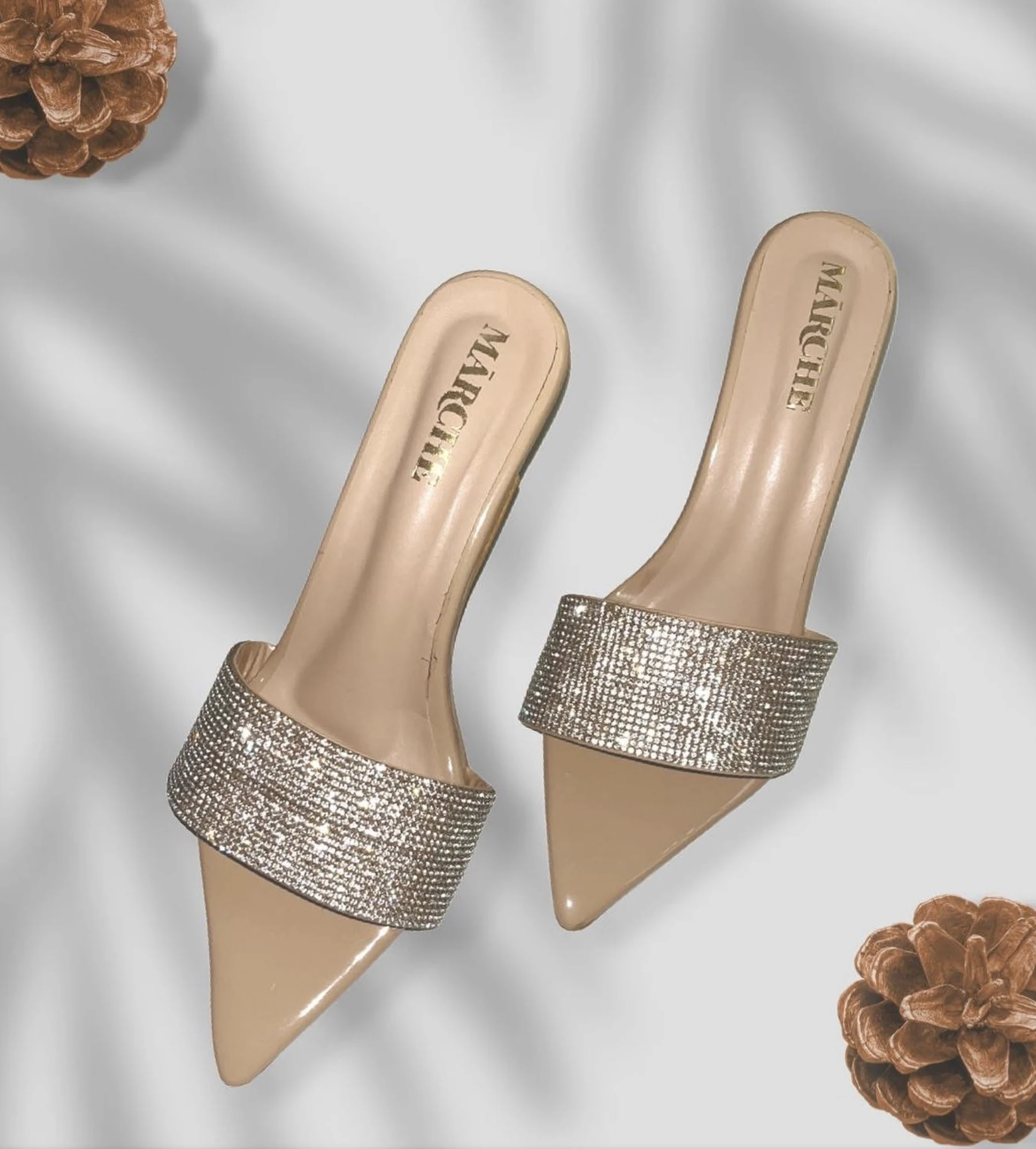
The final test of a footwear logo is the insole. It is small, curved, worn and seen every time the shoe goes on. The MĀRCHE wordmark, stamped in gold, keeps both details legible even there: the macron and the step of the R.
Why vegan brands need a strong identity
Shoppers who choose vegan products tend to read labels closely and compare brands carefully. They also expect a cruelty-free product to be every bit as good as the leather one beside it. An identity that looks considered is the first proof of quality a customer sees, long before they try a pair on.
What footwear founders can take from this
Choose a letterform with a reputation. A classic serif borrows trust from every fashion label before it.
Add one or two details, then stop. A macron and a stepping R are enough to make the name ownable.
Pick one warm colour and protect it. Gold on cream works from the box to the insole.
Write inside the box. A thank-you note in the brand's own words is the cheapest loyalty programme there is.
See the full identity on the Mārche project page, or read what a brand identity actually includes.