

Insights / HR tech logo design
HR tech logo design: how Workline built its W from a tangram
Seven pieces, one letter, any shape: a logo that explains how an HR platform fits itself around each company.

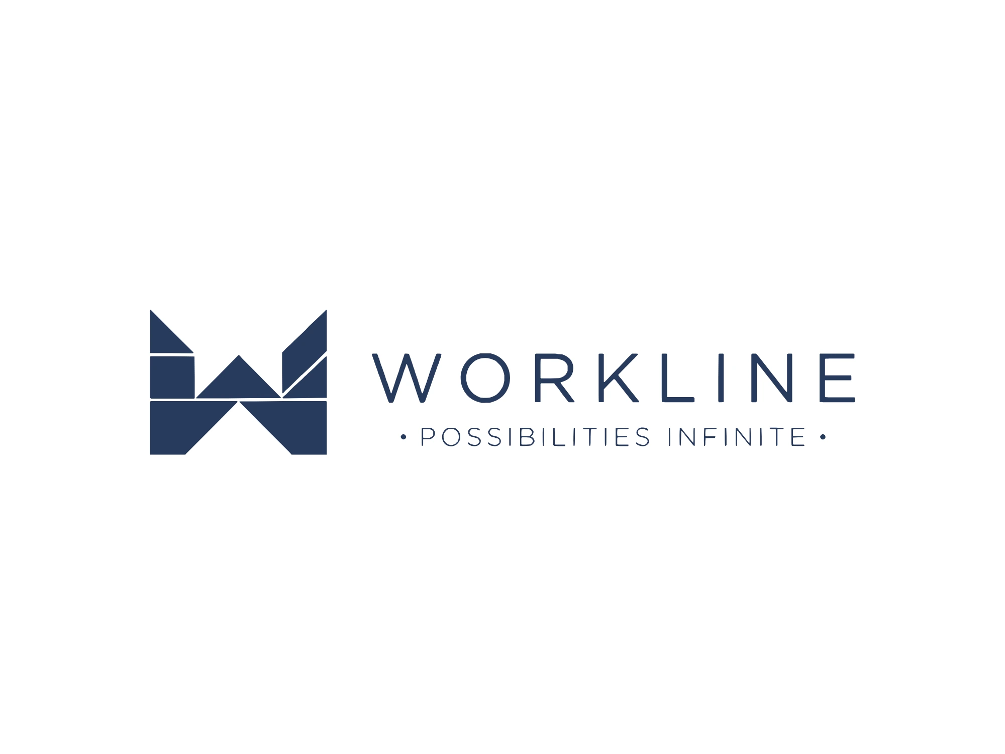
Most HR software logos look like the category: a person icon, a few connected dots, a calm shade of blue. They tell you the product is about people, and then they stop. Workline needed a mark that explains how its product actually works.
Workline is a SaaS HR management system from Mumbai, established in 2016 and built for organisations of anywhere from 50 to 100,000 employees. That range is the whole brief. A platform that serves a fifty-person startup and a hundred-thousand-person enterprise cannot have one fixed shape. It has to arrange itself around each company.
A puzzle that becomes any shape
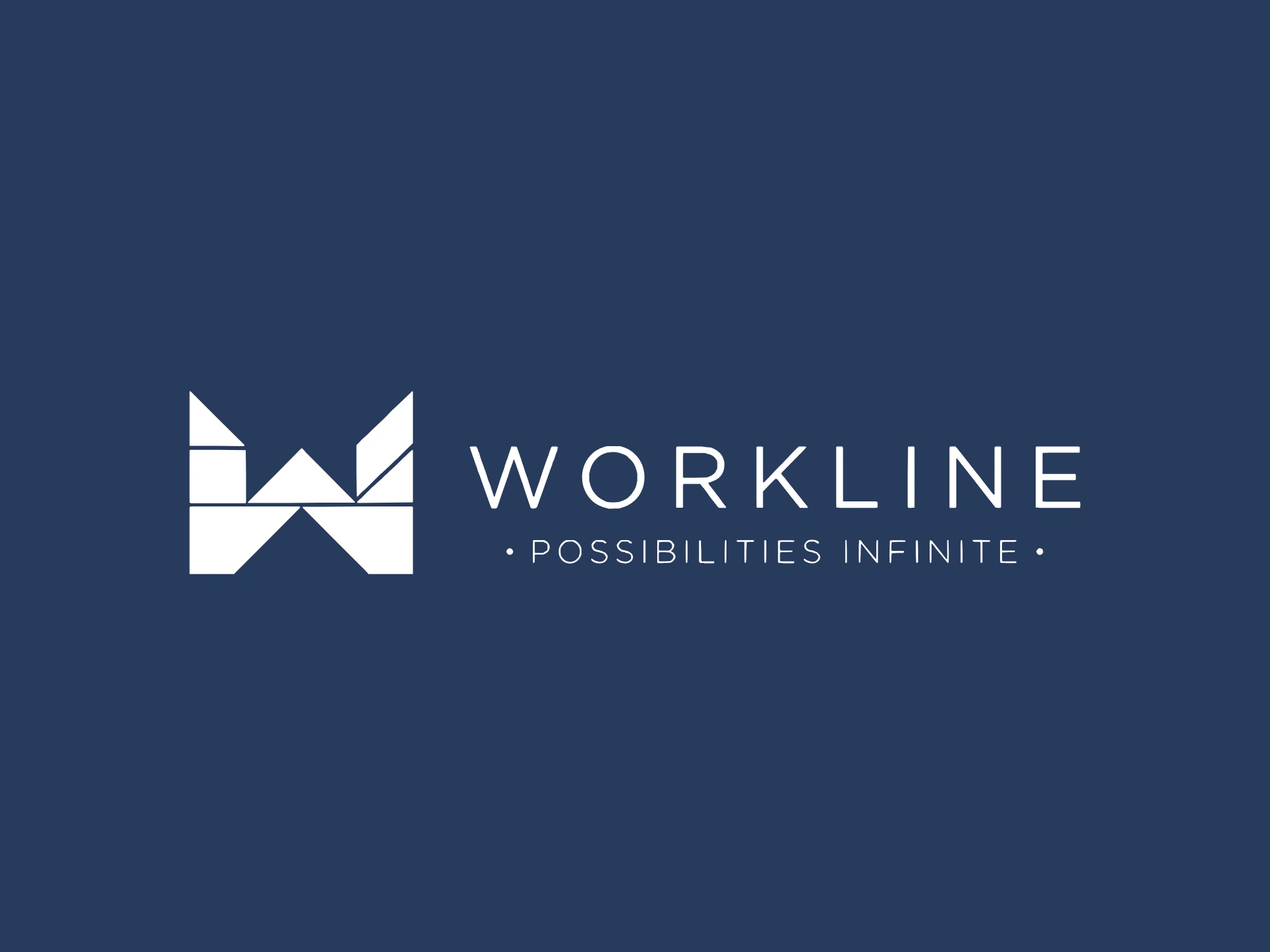
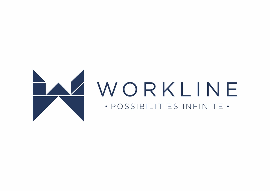
We built the W from a tangram, the ancient Chinese puzzle made of seven flat pieces. A tangram has no single correct picture. The same seven pieces become a bird, a boat, a figure or a letter, depending on how you arrange them. It is also a shape most people have played with as children, so the idea lands in a single look. That is exactly how Workline describes an HRMS: a set of key components, arranged and prioritised around each organisation's needs.
The best marks don't decorate the product. They explain it.
Seven pieces, seven components
Every piece of the W stands for one of the key components of an HRMS. Seen whole, the pieces spell the company's initial. Pulled apart, they become the platform's building blocks. Put back together, they show the promise: separate tools that fit into one system without leaving gaps between them.
Draw how the product works, not what the category looks like.
Possibilities Infinite
The tagline under the mark makes the same argument in two words. A tangram is the clearest proof that a small set of pieces can make endless shapes. Packaged HR software tends to hand every customer the same shape; Workline is configured to yours. The mark and the line say the same thing, so neither has to work alone.
Seven pieces. One W. Any shape the organisation needs.
Lettering that leaves room
The name sits above the tagline in wide capitals. Wide letters slow the eye down and give the wordmark the steadiness of a platform people log into every day, rather than the urgency of an app begging for a tap. They also balance the mark: the W is full of edges and angles, so the lettering stays plain and lets the puzzle do the talking.
Built to move
Because the W is made of separate pieces, it animates without being redrawn. The pieces arrive scattered and lock into place. They rearrange into a line and a climb before settling back into the letter. The same pieces scatter into a pattern for covers, slides and walls, and in our concept screens they assemble as the app opens. One set of shapes does the work of an entire motion kit.
What SaaS founders can take from this
Draw how the product works, not what the category looks like. A metaphor customers can see is worth more than an icon they have already seen a hundred times.
Let the mark and the tagline make one argument. When both say the same thing, each becomes easier to remember.
Build the logo in parts. A mark made of pieces becomes motion, pattern and interface without a redesign.
Keep the lettering quiet when the mark is busy. One element should do the talking.
See the pieces come together on the Workline project page, or read how Greater Than turned its name into a symbol.