









Insights / D2C organic food packaging design
D2C packaging design: how O FAM made organic look as honest as it tastes
Organic brands promise purity. The packaging has to prove it before the customer ever opens a pack.

Walk down any premium grocery aisle in Hyderabad and you will find the word "organic" printed on everything, often in green, usually next to a leaf. The claim has become so common it has stopped meaning much. For a D2C organic food brand, that creates a real problem: how do you look trustworthy when everyone else says the same thing?
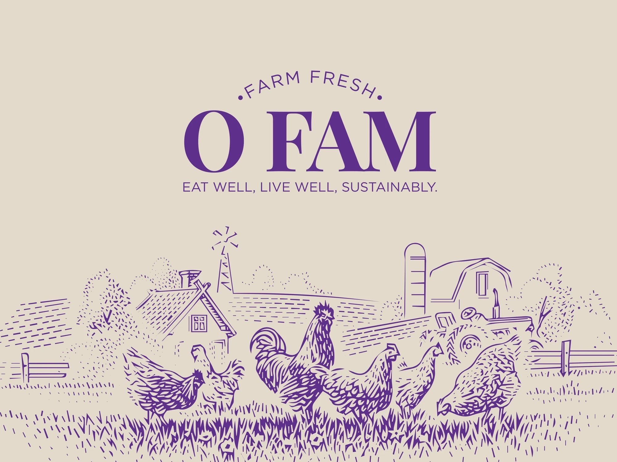
O Fam, a unit of Radhika Agro Products, brings ethically farmed eggs, chicken, mutton and seafood from Telangana's farms to modern kitchens. We named it: Organic. Farm. Family. O Fam answered the trust problem with restraint. The brand began with a simple, meaningful idea: to bring families closer to nature through the food they eat, with pure, unadulterated food sourced responsibly and shared with complete transparency. Its promise is written right under the name: Eat well, live well, sustainably.
Start with the promise, then remove everything else
The brand line is three words: Pure. Organic. Trusted. Every design decision after that was a test: does this make the promise more believable, or less?
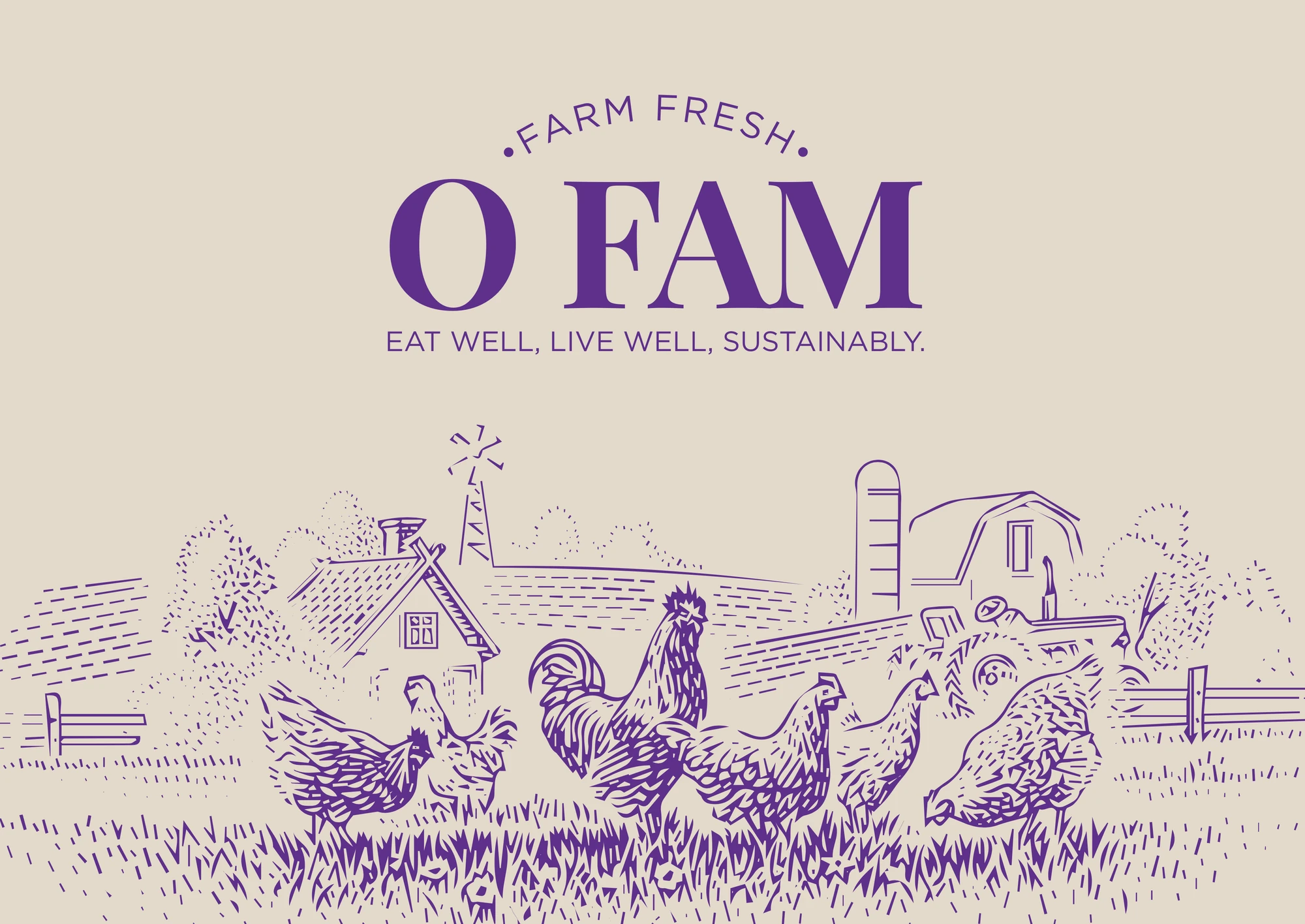
That ruled out a lot. No stock farm photography, no cartoon hens. What remained was a classic serif wordmark, a hand-engraved farmstead illustration that wraps every touchpoint, a small "Farm Fresh" arc above it and a lot of honest material.
Kraft, windows and colour you can navigate
The range covers organic eggs, toor dal and chicken curry cut, alongside an egg tray, shopping bag and invoice. We built the packaging on natural kraft stock with a clear window on each pouch, so customers can see exactly what they are buying.
If your product is the proof, the most honest thing packaging can do is show it.
Each product line gets its own solid colour band, aubergine for eggs, barn red for meat and field green for seafood and staples, running down the front of the pouch. It makes the range easy to navigate at a glance, in a fridge or on a delivery doorstep, without adding a single extra word.
The pack is the product’s first argument.
Why the invoice matters
For a D2C brand, the unboxing is the store. We carried the identity onto the invoice and shopping bag because those are the pieces a customer handles every single order. A well-designed invoice quietly says "we pay attention", which is exactly what an organic brand needs to say.
Lessons for D2C food founders
Make the claim once, then prove it. A single brand line repeated consistently beats a pack covered in badges.
Let the material speak. Kraft, windows and simple print methods signal honesty more than any "100% natural" sticker.
Colour-code for the second purchase. The first purchase is about trust; the repeat purchase is about finding the right pack quickly.
Design the whole delivery. Bag, invoice and tray are brand touchpoints. In D2C, they may be the only ones.
Organic, and the problem of trust
India's organic food market has grown quickly, and so has consumer scepticism. Shoppers have seen enough "natural" claims to know that a green label proves nothing. For a D2C brand without a physical store, trust has to be built entirely through what the customer sees and touches: the website, the delivery, the pack.
That is why O FAM's packaging does so little shouting. Every element is chosen to reduce doubt: a visible product, a plain material, a short promise and a consistent system across every item. When a brand holds back, customers tend to believe what it does say.
For Hyderabad's growing crop of D2C food founders, the lesson is simple. The pack is not decoration on the product. It is the product's first argument.
Explore further
See the complete range on the O FAM project page. For another founder story, this time about turning a party into a product, read how Unbox Your Party put a whole celebration in one box.