








Insights / Film production logo design
Film production logo design: how Roo La La Productions put Los Angeles in a film strip
A film strip, two frames and one city: a production logo that plays like an opening title.

A production company has an unusual problem with its logo. Its whole business is moving pictures, yet its mark spends most of its life standing still: on a letterhead, a slate, a social profile, the corner of a pitch deck. The best production logos solve both. They work as a still, and they come alive when the film starts.
For Roo La La Productions we built the identity from the oldest sign in cinema, and then made it move.
A film strip needs no explaining
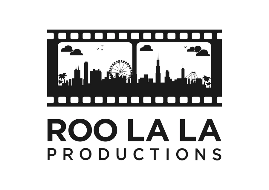
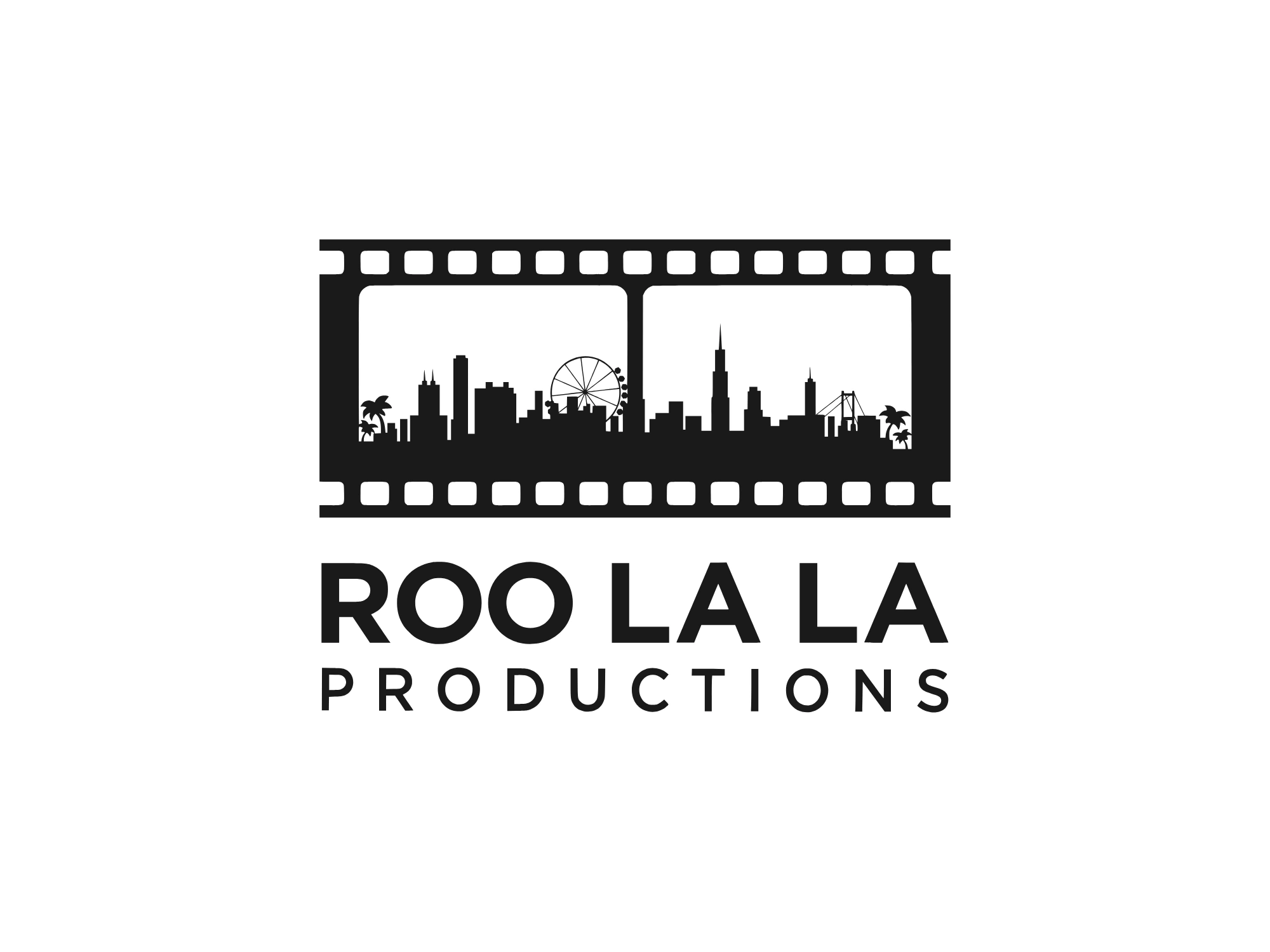
Perforations along the top and bottom, frames in between, a reel that only moves forward. Anyone who has ever been to the cinema reads a film strip instantly. That gave the mark its first job before a single letter appears: this is a company that makes films.
The fastest logos borrow a shape the audience already owns.
Two frames make a cut
We gave the strip exactly two frames, side by side. Two frames are the smallest unit of editing: one scene, then the next. That simple decision builds the grammar of film into the mark itself, so it reads as a story, not just a picture.
One city, two scenes
Inside the frames is Los Angeles. On the left, the beach and the pier with its Ferris wheel, palms at the edge of the frame. On the right, downtown: the towers, a bridge and more palms, with the sun low in the sky. Clouds drift and birds cross both frames. It is one city cut from one scene to the next, which says something a camera icon never could: where the stories happen.
A title card for a name
The name is playful, so the lettering is not. ROO LA LA is set in heavy geometric capitals, and PRODUCTIONS in light capitals tracked out to the full width of the strip, the way a credit sits under a title. Black and white only: like a title card, the mark never takes a colour, and lets the footage around it bring the colour instead.
A production logo should look like the first frame of a film, not a sticker on it.
Built to move
Because every part of the mark is its own shape, it animates without being redrawn. The strip rolls in, the two skylines rise into their frames, the sun and clouds drift in, the birds take off, the wheel's cabins light up one by one, and the title lands. The same parts make a night version, with the wheel glowing, and a sunset silhouette. The opening title, the reel sting and the slate all come from one file.
Rules that measure themselves
The guidelines use the film as their ruler. Clear space around the logo equals the height of one perforation, so the mark sets its own margins at any size. Where the skylines become too small to read, the strip stands alone as an avatar or a watermark.
What production founders can take from this
Start from the medium. If your work is film, the language of film is your strongest visual asset.
Build a story into the mark. Two frames say more than one: a cut, a journey, a before and after.
Keep it black and white. Your footage will always be more colourful than your logo; let it be.
Design the motion from day one. A logo built in parts becomes your opening title, your sting and your watermark, all from one file.
See the mark come alive on the Roo La La Productions project page, or read how to name a brand in India.