



















Insights / D2C packaging design
D2C packaging design: six boxes, labels and inserts, and what each one is for
For a brand that sells online, packaging is the first thing the customer actually touches. These six pieces show what it can do.

A D2C customer has seen your product only as a photograph. The packaging is the moment the photograph becomes real. If the box looks cheaper than the website, the customer feels it immediately. If it looks better, they post it.
Good D2C packaging does four jobs: it protects the product, it tells the customer what is inside at a glance, it carries the brand into their home, and it gives them a reason to buy again. Here are six pieces we have designed, each built around one of those jobs.
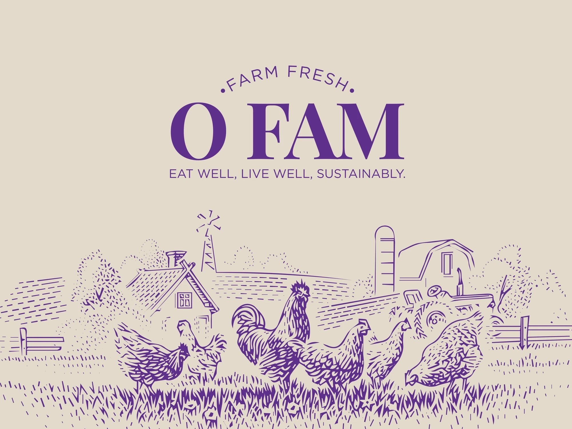
O Fam: telling a range apart at a glance
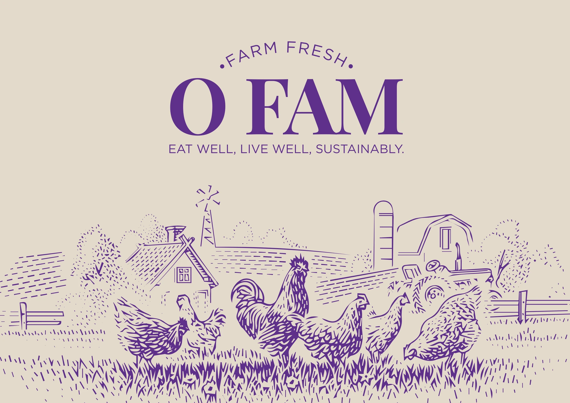
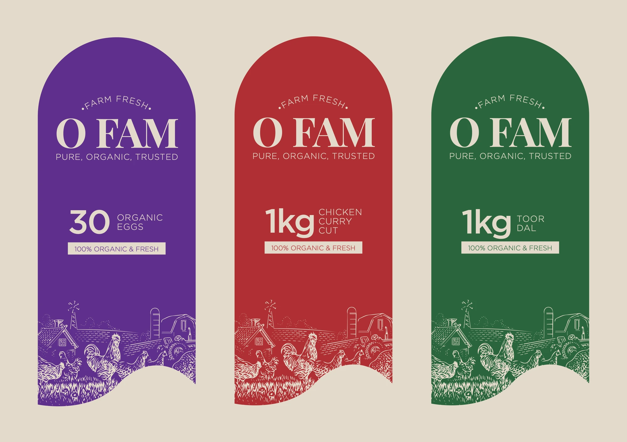
O Fam brings ethically farmed eggs, chicken, mutton and seafood from Telangana's farms. The risk with a food range is that every pack looks the same. So we coded the range by colour: aubergine for eggs, barn red for meat, field green for seafood and staples, all under one hand-engraved farmstead that wraps every label.
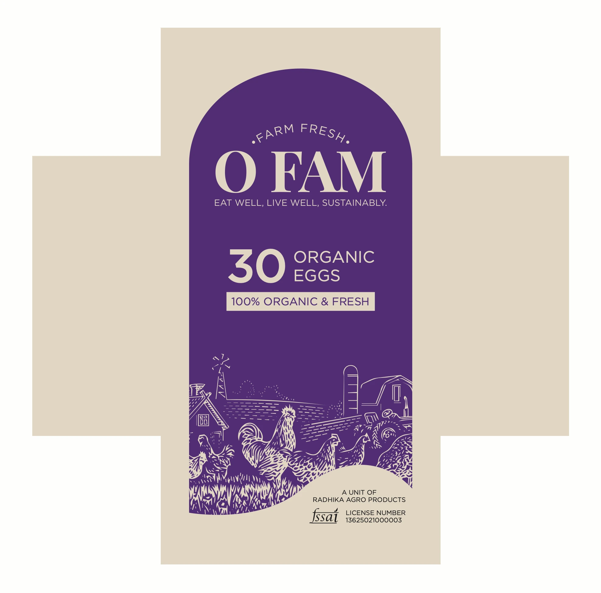
The lesson: when you sell more than one product, design the system before the single pack. Read the full story in how O Fam made organic look honest.
Do Taar: one colour that owns the parcel
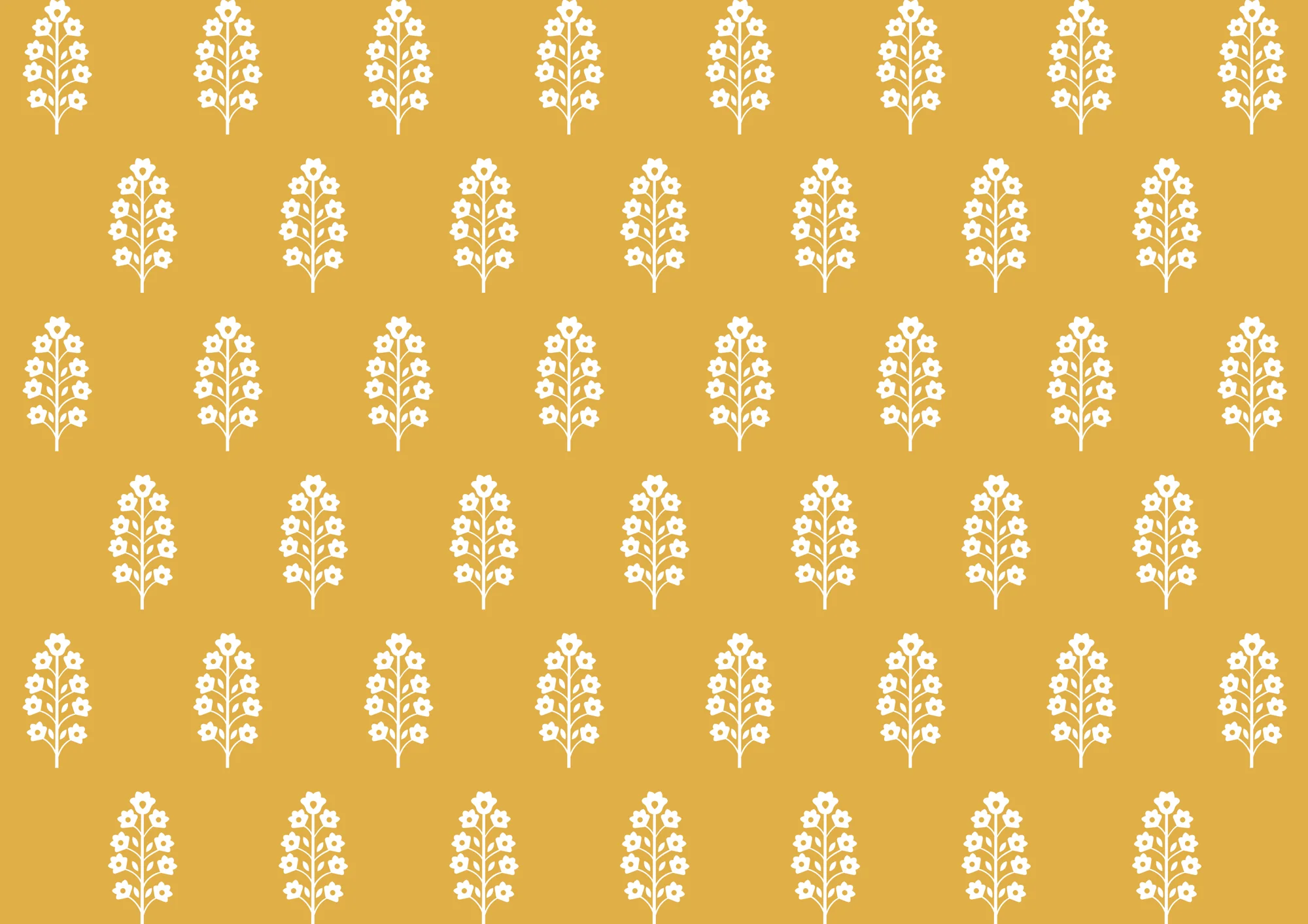
Do Taar is a chikankari house. Its packaging uses one marigold yellow on every box, stamp and tag, with a booti motif drawn from the artisans' own sketchbooks. A single owned colour is the cheapest way to be recognised the moment a parcel arrives.
Mārche: the box that says thank you
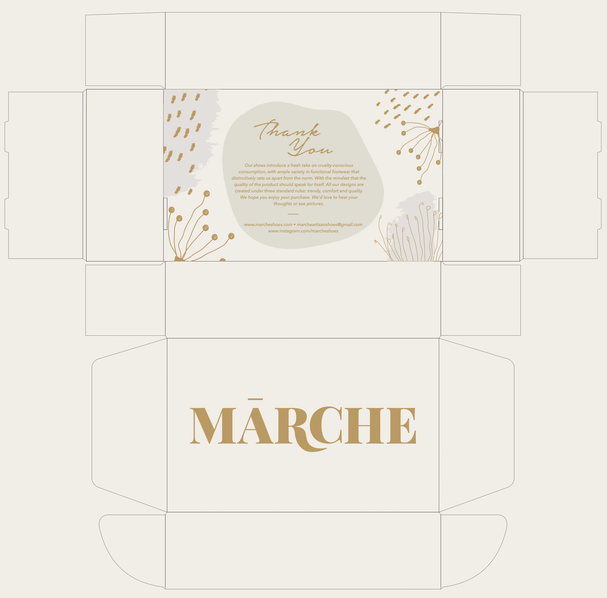
For Mārche, a vegan, PETA-approved footwear brand, we designed the mailer box: the name in gold on the lid, and a thank-you note inside. The mailer is often the only packaging a D2C fashion brand controls, so it has to carry the whole brand.
Gradi Pizza: a box that works as a poster
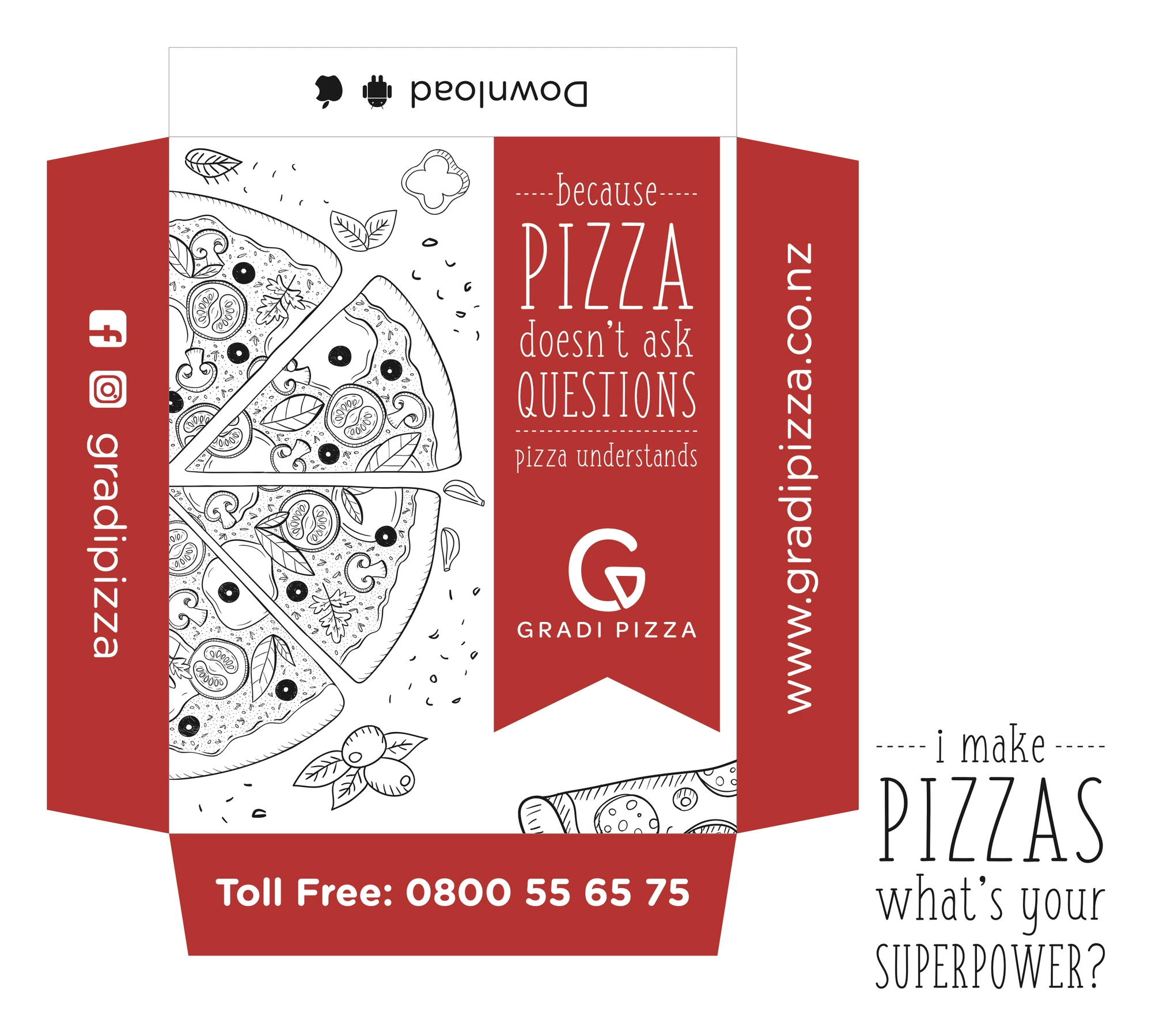
For Gradi Pizza, an outlet in New Zealand, the box carries the drawing, the mark, the phone number and the website. A delivery box spends time on a table with the whole family looking at it; it should tell them how to order again.
Sorin and House of Pops: the small surfaces
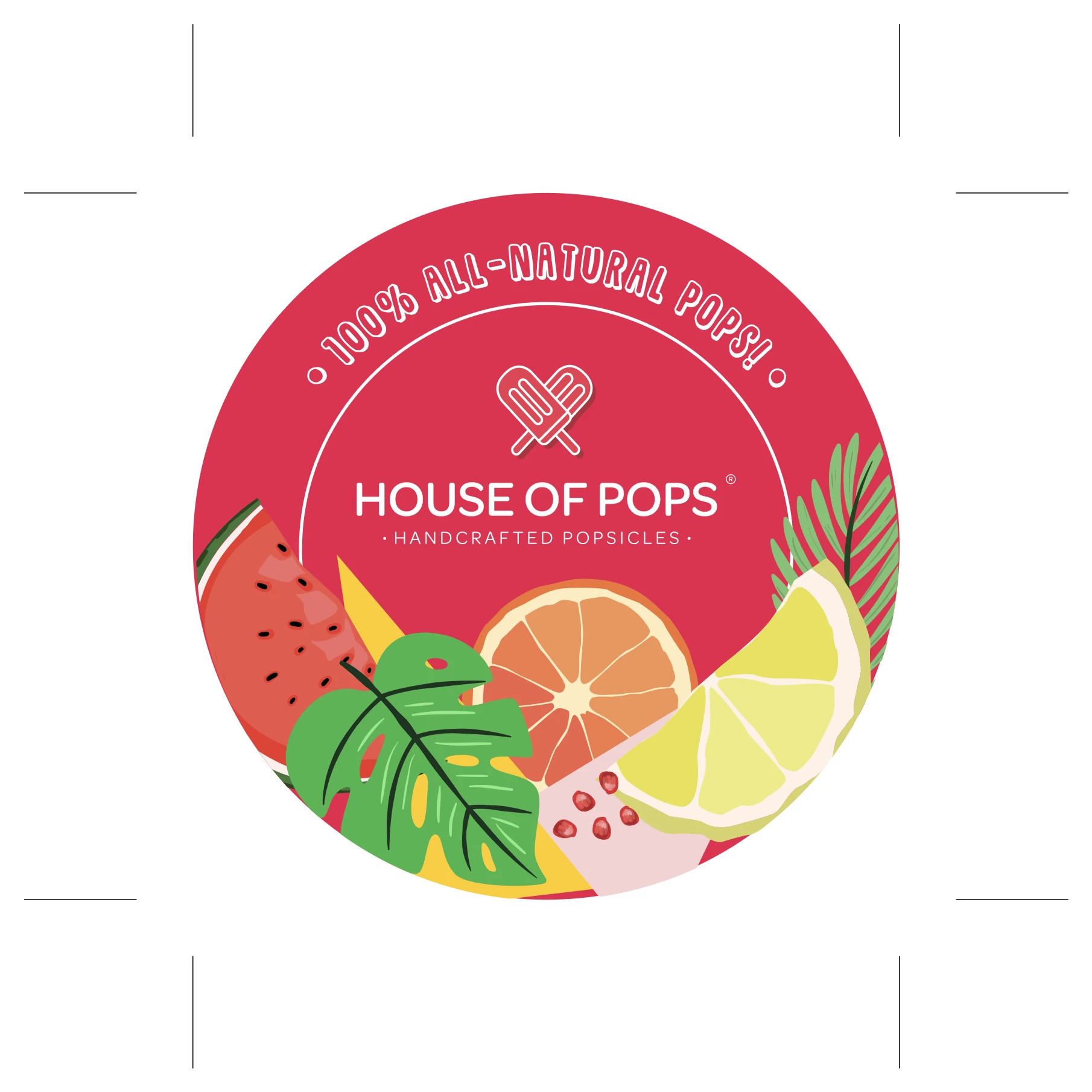
Cups, lids and stickers are packaging too. For Sorin, a café in Jubilee Hills, the takeaway cups carry the wordmark and the line drawings; for House of Pops, the lid is a little poster of watercolour fruit. These are the pieces customers photograph most.
Materials and print, briefly
Kraft and uncoated stocks feel handmade and forgiving; coated boards hold strong colour and fine type better. Test your colours on the actual stock before a full run, because a brand colour on screen and on cardboard are rarely the same. And design the flat dieline, not just the 3D mock-up: the flat is what the printer receives, and it is where the side panels, flaps and inside print are won or lost.
A short checklist for D2C packaging
Design the range, not the pack. Decide how products differ (colour, number, band) before you design any one of them.
Own one thing. One colour, one pattern or one mark that appears on every parcel.
Print the way back. Website, handle and how to reorder belong on the box or insert.
Plan the unboxing. The note, tag or sticker inside is the moment people share.
Your packaging is the only part of your shop the customer keeps.
Planning packaging for a D2C launch? Read what a D2C brand needs before launch, or see more of our work.