






Insights / Pizza brand identity and packaging design
Pizza brand identity: how Gradi Pizza made hunger its colour
A new pizza shop in New Zealand needed everything on day one. We built it on one red, one mark and one drawing.

Opening a pizza shop means opening into a crowd. Every street already has a pizza place, and every one of them is red. When Gradi Pizza was getting ready to open in New Zealand, the team asked us for the whole brand at once: the logo, the box, the posters, the signs, the flags, the crew T-shirts and the menu. Everything a new shop needs on day one.
Start with what people actually feel
Nobody walks into a pizza shop to admire it. They walk in hungry. So the brand had one job: look like hunger, and be recognised from across the road. A food brand is judged by the stomach before the eye. Everything we made follows from that.
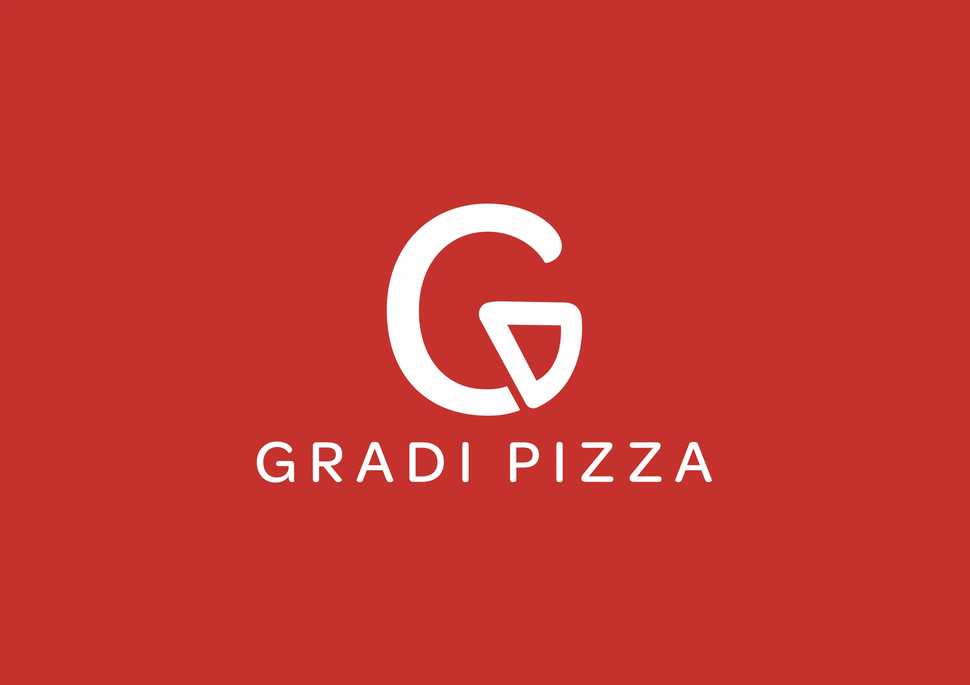
A slice inside the G
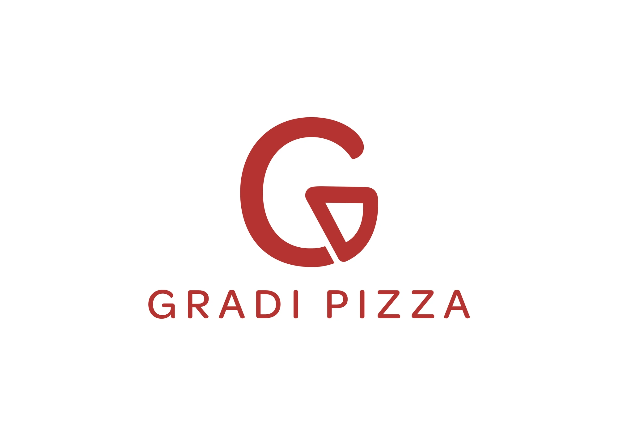
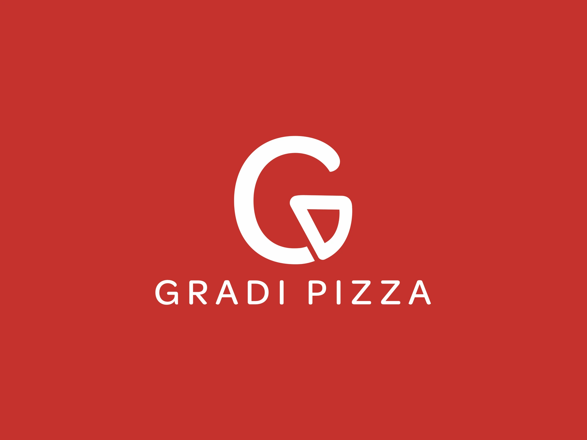
The logo is a G whose bar bends down into a slice of pizza. It is the simplest possible way to say what the shop sells without a picture of a pizza or a line to explain it. Underneath, the name is set in wide-spaced, rounded capitals that stay readable on a box lid, a flag or a phone screen.
We drew it to work on three backgrounds, red, black and white, because a new shop prints on everything and cannot afford a logo that breaks on any of them.
Hunger decided the colour. Discipline kept it.
Why red
Red is the colour of tomato sauce, a hot oven and an empty stomach. It raises the pulse, it is the first colour the eye finds on a busy street, and it is the colour most tied to appetite. Plenty of pizza brands use it. The difference is discipline. Gradi uses one red, plus white and black, and nothing else.
The trick is not choosing red. It is refusing every other colour.
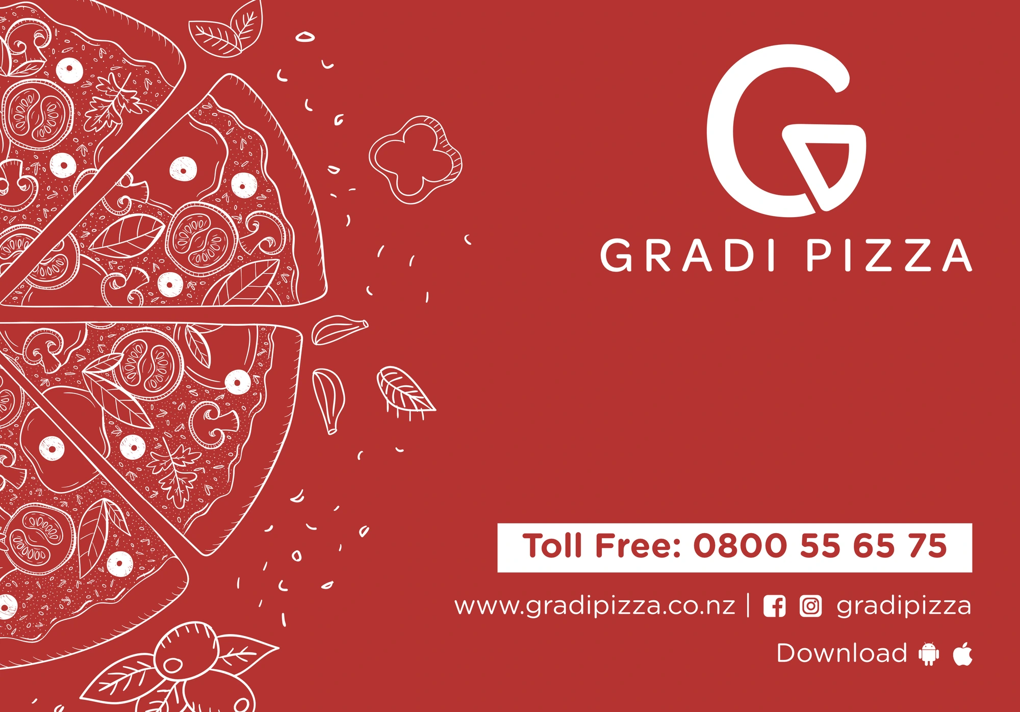
One drawing, used everywhere
The second asset is a hand-drawn pizza: slices pulling apart, mushrooms, tomato, basil and olives tumbling off the edge. A drawing feels made by hand, which is exactly what a pizza shop wants to say. On the red lid it is reversed out in white. On the box top it is black on white. On the menu cover it is split by the fold. Inside the posters it frames the offer.
For a founder, this matters more than it looks. One drawing means every new poster, board or flag can be made in an afternoon and still look like part of the family.
Two voices on the walls
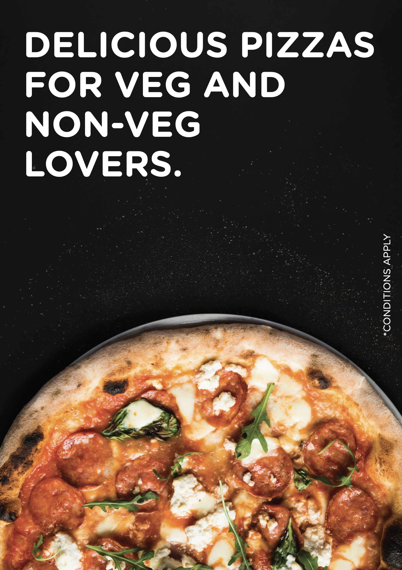
The in-store posters speak in two ways. Red posters, with the drawing, carry offers and the reward program in big, round capitals you can read from the queue. Black posters carry real food photography, because nothing makes melted cheese glow like a dark background. Every poster has one message, and only one.
The box gets a softer, hand-lettered voice: because pizza doesn't ask questions, pizza understands. It is the line people read at home, with the lid open.
A uniform with a punchline
The back of the crew T-shirt says: I make pizzas, what's your superpower? It costs nothing, makes the people behind the counter part of the brand, and it starts conversations in the queue. Outside, the feather flags and the store front boards keep the same red, the same G and the same drawing, so the shop is recognised before the door opens.
What founders can take from this
Design for the feeling first. Hunger, not decoration, decided the colour and the drawing.
Keep the kit small. One colour, one mark, one drawing is easier to keep consistent than a big palette.
Let every surface work. The box, the shirt and the flag reach more people than any ad.
Give each piece one job. One message per poster is what makes it readable at a glance.
If you are opening a food business, build the brand like a kitchen builds a menu: a few great ingredients, used again and again, done well every time.