




























Insights / Couture and fashion brand identity
Couture brand identity: how Rüya gave a dream a shape
Rüya is Turkish for dream. Naming a couture stylist after one meant designing a feeling as personal as the clothes.

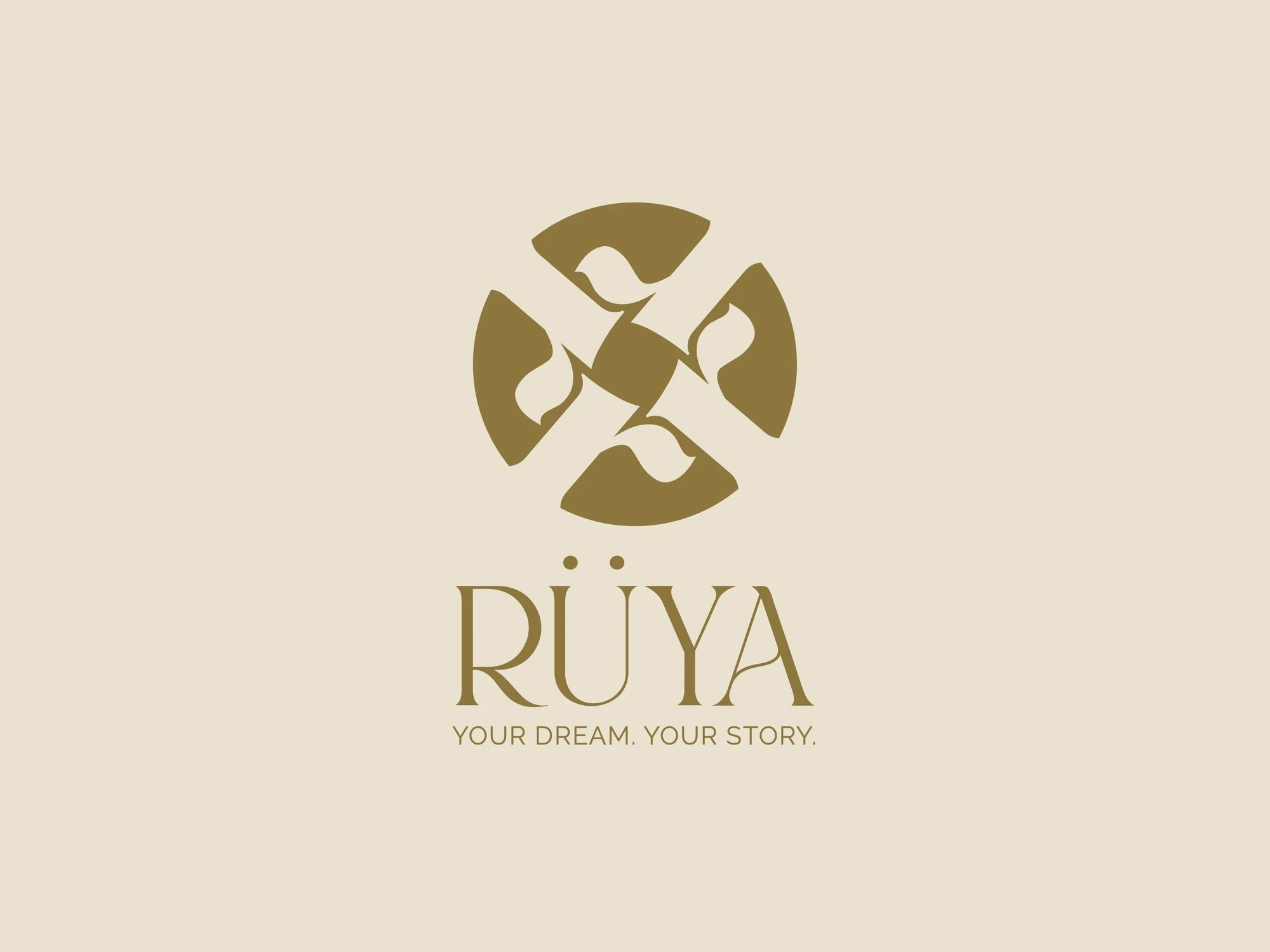
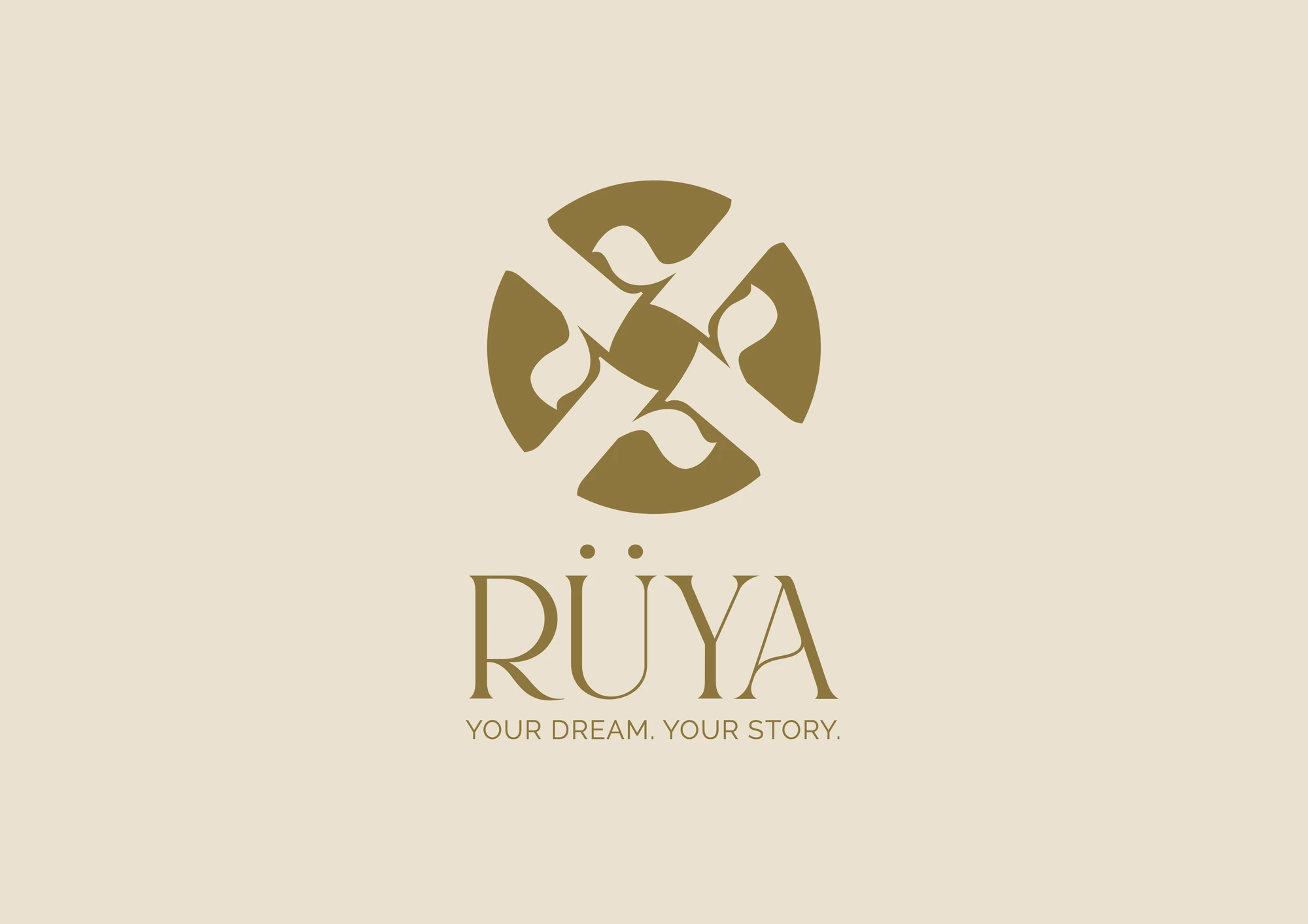
Some names give a designer a head start. Rüya is Turkish for dream. Rüya by Divya Reddy styles heirloom-worthy South Asian couture for weddings and celebrations across the US and India, where heritage meets haute couture. It's poetic, easy to say, and it carries a mood before a single mark is drawn. The risk with a name like that is taking it too literally: moons, clouds and soft gradients that feel pretty for a week and forgettable after a month.
Our aim with Rüya was to design the feeling of a dream, not a picture of one.
Designing a feeling
Dreams are hard to pin down. They are soft at the edges, vivid in the middle and gone the moment you try to describe them. We translated that into a few simple rules: a light, airy mark; generous space around everything; and typography with enough character to be remembered but enough restraint to stay calm.
The most dreamlike designs are often the most disciplined. Softness needs structure underneath it.
The final identity turns four songbirds into a mandala-like monogram, set over a hand-etched garden of warblers and blossom in antique gold on cream. The tagline came with it: Your Dream. Your Story. It works at the size of a clothing tag and at the scale of a lookbook cover.
Cards, digital and printed
A couture brand spends much of its early life in conversation: introductions, launches, invitations and thank-you notes. We designed Rüya's card system in two formats, digital cards made for sharing on WhatsApp and Instagram, and printable cards for packaging and in-person moments.
Both share the same layouts and typography, so the brand feels identical whether a customer meets it on a phone screen or finds it tucked inside a parcel.
Design the feeling, not the picture.
The lookbook as the brand's voice
For a label, the lookbook does more storytelling than any advertisement. It sets the pace, the mood and the attitude of a collection. We designed the Rüya lookbook to give the images room: large photographs, a quiet grid and very few words. When a brand is confident, it doesn't need to explain every page.
Lessons for fashion and couture founders
Design the mood, not the metaphor. If your name is poetic, let the layout and typography carry it rather than illustrating it literally.
Make digital and print twins. Your WhatsApp card and your parcel card should feel like the same object.
Let the lookbook breathe. White space is what makes photography feel premium.
Keep the logo simple enough for a tag. A label's mark lives on fabric, stickers and screens at tiny sizes.
Why small labels need strong identities
Boutique labels often launch on Instagram with little more than a logo and a few photographs. That's fine at first, but as the customer base grows, gaps start to show: inconsistent cards, mismatched packaging and a feed that changes with every photographer.
An identity system is what lets a small label look as considered as a big one. When the logo, card templates and lookbook grid are designed together, every new collection slots into an existing frame. The founder spends less time on layouts and more on the product, and customers experience one coherent brand, whether they discover it online, at a pop-up or through a friend's recommendation.
See the identity
The full work is on the Rüya project page. For another label rooted in craft and colour, read how Do Taar turned two threads of chikankari into a brand.